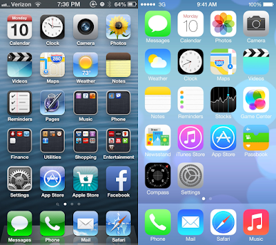
I notice one the the patterns in the development of art is that things start very simple in visual, then start getting complicated, but in the end it will go back to an extreme simple form but contain all the complicated meanings within the simple sign. For the applications icon designed by Apple inc, apple is aiming for the simplicity but still very informative image of icon. Now, everything is so flat with plain color but we still can understand the meaning of the icon. However, if you all remember, the first version of the icon was still very visualization in the form of recreate the actual shape/form of the actual object.
the old apple interface/the new apple interface
For example. The icon for "Safari" is a compass. First of all, the word safari means journey, originally from the Arabic adjective سفر (safar) meaning a journey, travelling, touring or voyaging. It makes sense for an app which is use for browsing the information about the entire world (even include the universe), it does has the feeling of "travelling" when we search information. Which explains why the icon is a compass. Next, in the old version of the Safari icon, we can clearly see the four directions of the compass, the needle on the compass, the measurement lines and even a shade of the earth map. Compares it with the newest version, which we can only see the needle on top of a graduate blue circle with some white lines. First of all, we don't even see any shading in the new icon anymore, it only have the minimum info we need to identify the meaning of the image.
the old safari logo the new safari logo
This is a good example in understanding Barthes's quote from Image-Music-Text, “The more technology develops the diffusion of information (and notably of images), the more it provides the means of masking the constructed meaning under the appearance of the given meaning” (46, Barthes). Now after apple trained us to connect the compass with browser, next time we see a blue compass image (denoted image), we will think about the word "safari" (the symbolic message). We used to have some linguistic message in the old icon "N, S, W, E" indicating the four directions in geology. In the new logo, we don't even have it anymore, but the meaning remains.
My question is that is this really because we don't actually need that much detail to recognize the image, or we are just being slowly trained to accept those info into our mind by seeing apple gradually taking out the details from the logo? Can we really understand the image above on the right without seeing the transition of the logo from the left to the right? I might do some social experiment, asking very young kids or older people to see the simple safari image only, to see what they will react and identify it.
How is this related to my project? I am about to share something about my favorite band, BTS now!
This picture below is the cover of BTS's newest album "BE". This is one of the most simple album cover they have, it only contain some linguistic message (BE & some sentences) with a simple logo in the bottom. However, there are so many meaning behind it.
BTS album cover -- "BE"
from the top, we can see 2 simple letters "B" and "E". When they put together, that becomes the english word "be", the group leader RM explained the title that "In Korea when we learn English grammar, the first thing we learn is the 'be' verbs. It could be, like, are, is, am. So it means existence, potentials. It could be anything -- to be present in the moment" (Glenn). BTS gives the symbolic meaning of "be" in their own way, which help us to think about the word from another perspective. After the title, we have 5 lines of sentences in hand-written font. When we only take a glance of the cover, we can only see the sentences as some sort of image that is listed and designed on the white background. In fact, it is the lyrics of their title song of that album, "
Life goes on". If you read the lyrics, they are only sentence, interesting thing is that after they become lyrics, it also gives the sentence an assigned "melody", after knowing the song, you can't read the sentences without thinking about the melody of it. Which is another aspect of perception in meaning. Eventually, in the bottom, we have a simple icon, which is the logo of the group. It contains two simple trapezoids, and here is an explanation of it:
BTS stands for bulletproof boy scout, and army is their fans nickname. BTS has always treating their fans nicely and always believe that their army are the people who support them to overcome everything and achieve everything they have today. Therefore army is also part of BTS. They say "BTS is ARMY, ARMY is BTS". The connoted image behind the meaning is just really amazing and attractive for me because it just make sense in the way that we never think about before. This logo is actually also a new logo of BTS, when they first debut, this is how the original look like:
This is literally the translation of the word "bulletproof" by showing a bulletproof body armor. As time changes, BTS starts to develop their understanding and identification of themselves as a group, and their unique relationship with the people who give them all the love and support, they make the change of the logo and include more symbolic meaning of it. It is both a development in the meaning of word, and the meaning of the experience.
I don't know how much this really relate to my final project of MV making, but it definitely gives me some inspiration on how to perceive words and images, and lyrics. Our production team have developed the script draft for Jeayahr's song "Senior Speech", and about to go location scouting later this week. I am excited to use image to create more meanings in the future!


I think its so interesting to deconstruct the images we are around today to their very literal meaning, especially because we can carry thousands of icons in our pockets. Your analysis can definitely tie into how you record your music video and what you show in frame. Maybe you deceive your audience with a scene?
ReplyDelete